Bailrigg 80s
At the start of my first year of university, my friend invited me on as a guest for the first episode of his film centred radio show. It would be the only episode of that show that would ever air, and my friend’s last outing on OFCOM regulated airwaves. However, I noticed two turntables in the back corner and asked someone at the station “do those work?” to which they responded “we haven’t actually checked.
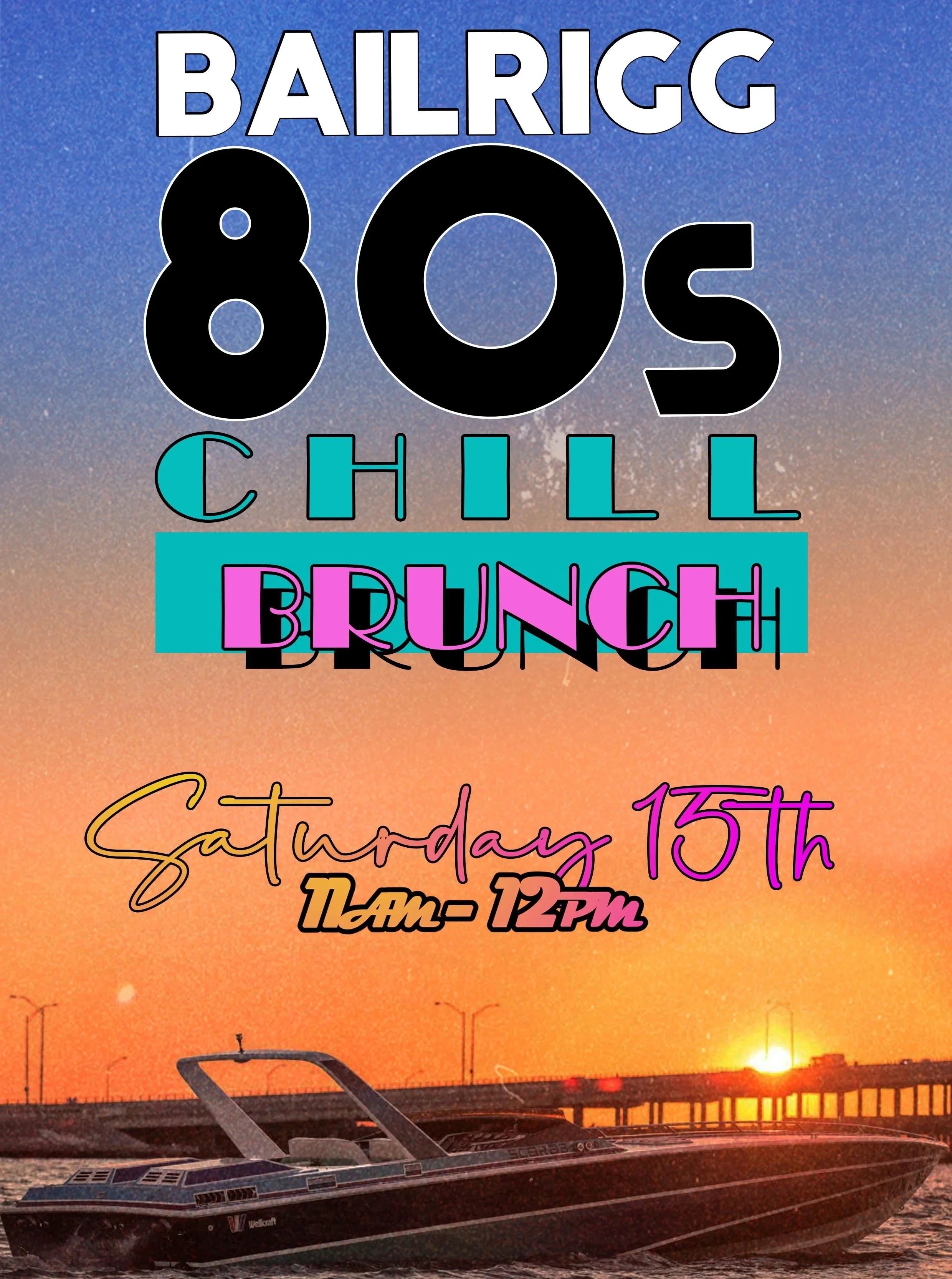
Within a couple of weeks I was hosting my own radio show, with the station turntables seeing their first use in a very long time, as I brought up an assortment of my extensive 80s record collection from home. This was a great opportunity also to create some very 80s promotional materials to post on social media.
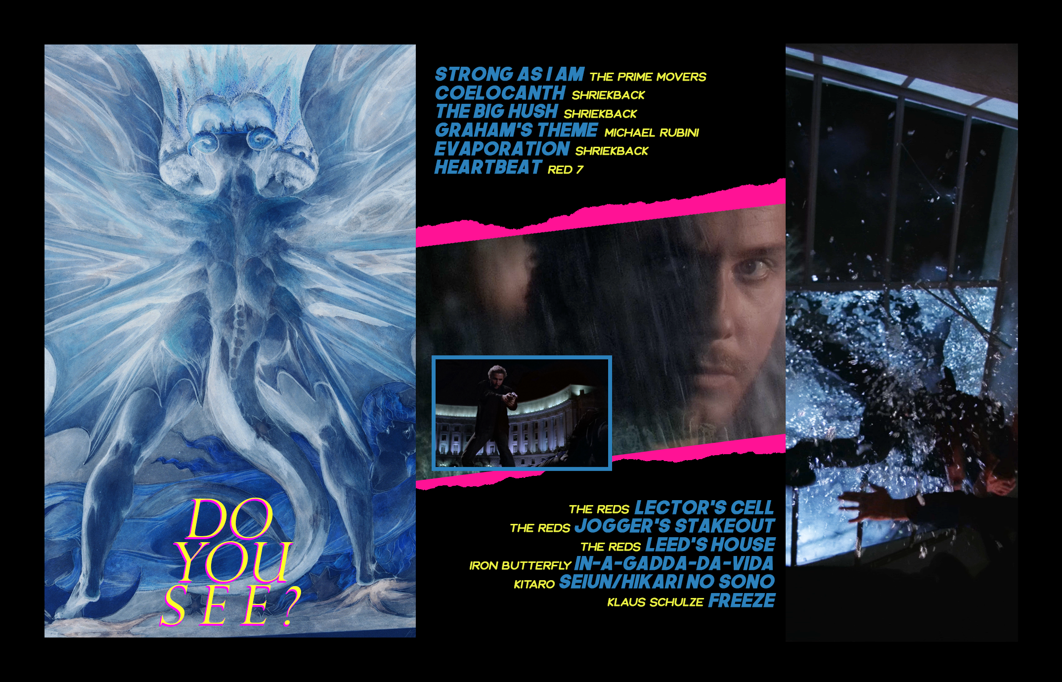
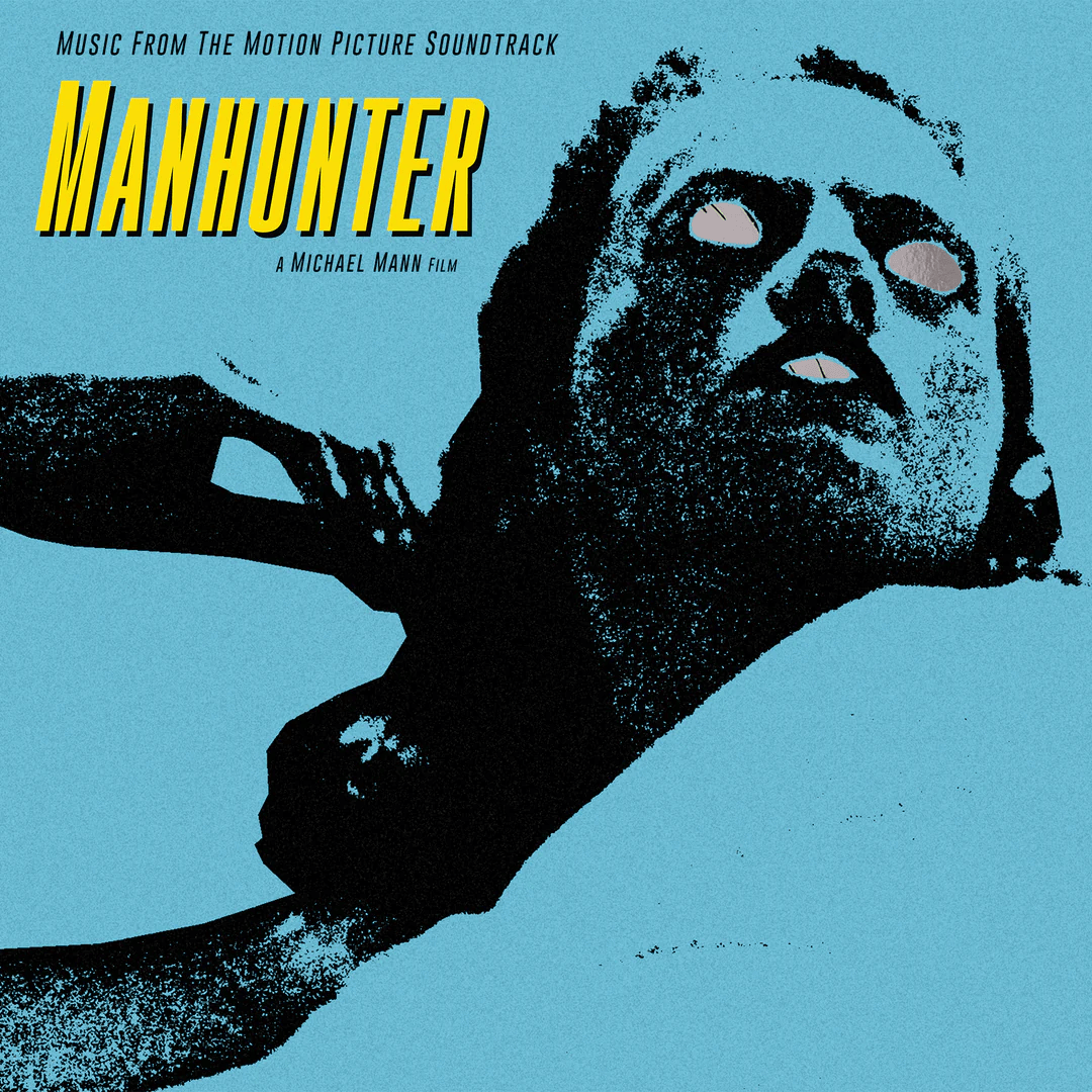
Custom Manhunter Soundtrack J-Card
One of my all time favourite design projects was creating a custom cassette J-Card for the soundtrack of my favourite film, Michael Mann’s Manhunter. The film came and went in 1986 with little fanfare or acclaim, making original copies of the film’s soundtrack on cassette or vinyl very hard to come by, and very expensive when they do show up. The idea was to physically manufacture a couple with my design for me and my fellow designer friend and, at the time, the only other person I knew who’d seen the film. Unfortunately, while I had a Hitachi boombox I could use to sync a digital input onto tape, buying the tapes and cases themselves was primarily reserved for bulk, industry orders.
To spice up the “Red Dragon” Chinese character utilised by the film’s antagonist, I “borrowed” the artwork for the Waxwork record’s re-release of the film’s soundtrack (which I do own). The use of the symbol, while inspired by the film, was influenced also by the gorgeous French Blu-Ray release of the film (which I also own).
Bailrigg 80s
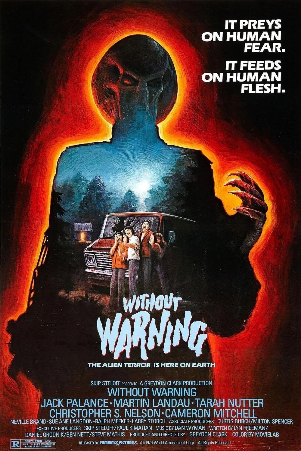
This poster, designed for my A-Level Film Studies project, continued to make apparent the influence of 80s horror cinema. Based primarily off the poster for John Carpenter’s “Prince of Darkness” (playing also on the tag-line for “The Thing”), and I also utilised some painted textures from “Without Warning”.
At this stage of my design work, I was particularly focused on trying to make my designs feel physical, not digital. I would always overlay various textures, like crumpled paper and film grain, to give the feel of a piece scanned in, not printed out.
Cinema Shindig Leaflets
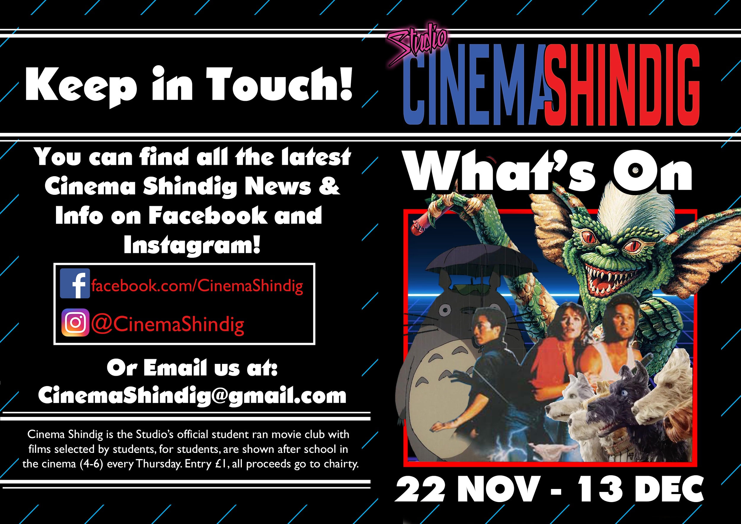
My secondary school, The Studio, had a very impressive cinema. While mostly used for assemblies and the occasional guest speaker, my friend Raymond saw a greater potential. He established Cinema Shindig with a Chinese New Year screening of Wong Kar-wai’s “Chunking Express”. I offered my assistance in running this first screening and it soon became a joint venture. Our first year was not very successful. Screenings were ad hoc and inconsistent, we lacked any real presence in the school and, as a result, few beyond some of our immediate friends would attend.
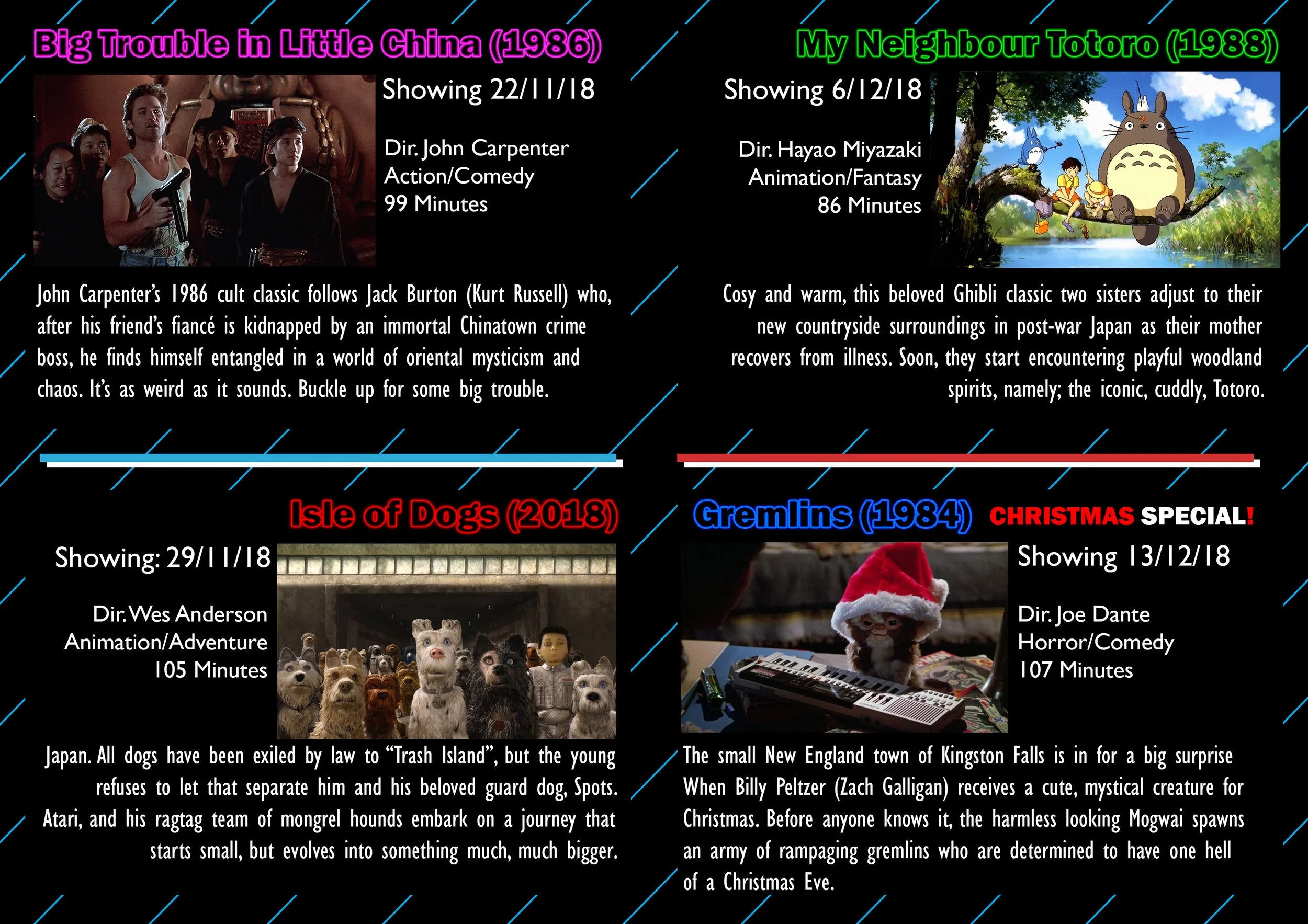
For our second year, I initiated a complete overhaul of our operations. We would have a regular schedule, four week blocks of weekly screenings with a two week break between them, and we would heavily promote ourselves under a new brand image. I designed a logo and booklets covering each four week block, and Ray would design the posters. I set up social media pages to post these designs and behind the scenes images from upcoming films (as well as photos from the screenings themselves) to promote our screenings. Our second year proved so successful that, as we prepared for our final exams and our time at the school came to an end, we were asked to write up a constitution, enshrining Cinema Shindig as a feature of school life that would endure beyond our parting.
